


LOOKS GOOD – SAYS NOTHING
ON THE DIFFERENCE BETWEEN BEAUTIFUL & MEANINGFUL
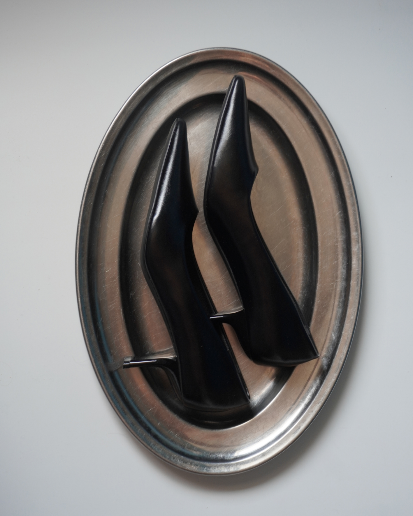
There is a certain moment when a brand starts to look almost too good.
The logo is perfect. The website is immaculate. The campaign feels expensive. Even the packaging looks like it belongs in someone’s carefully curated apartment.
And yet, after looking at it all, you are left with a surprisingly simple question:
What exactly is this trying to tell me?
PRETTY IS NOT THE POINT
Aesthetics are part of fashion and lifestyle. Of course they are. But somewhere along the way, “Does it look good?” became an almost universal test of quality.
Would I save this?
Would I post this?
Would it look good in a magazine?
Useful questions, perhaps. But not the most important ones. Because a beautiful image can communicate desire, status, intimacy, rebellion. Or it can simply communicate that a brand had access to a very good photographer.
The problem is that visual codes have become remarkably similar. Expensive serif. Muted colours. Plenty of white space. A perfectly imperfect photograph. Everything feels considered, but increasingly, everything starts to feel familiar.
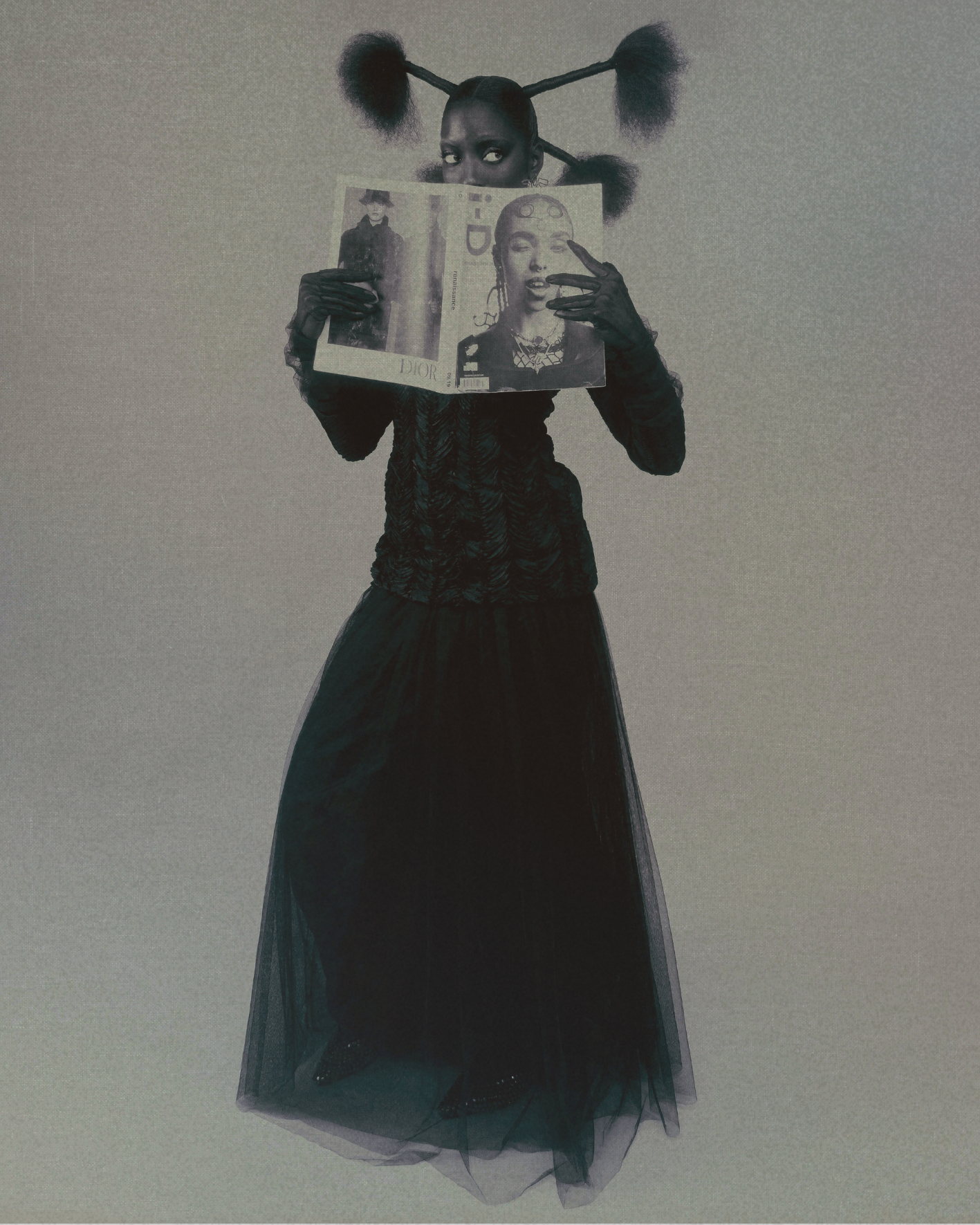
Minimalism was supposed to create clarity. Sometimes it creates anonymity instead.
EVERYTHING HAS A JOB
Good design asks a slightly more uncomfortable question than “Does this look good?”
It asks: What does this need to do?
A campaign might need to create emotion. A social post needs to earn attention before the thumb moves on. A product image needs to make you understand what you are looking at.
The point is not to make every piece of communication louder, busier or more obvious. Quite the opposite. Good design can be quiet. It can be strange.
It can even be ugly. It just cannot be meaningless.
And perhaps that is the more interesting question to ask of beautiful communication: not whether we like looking at it, but whether it gives us a reason to keep looking.
Because if beauty is all you have to say, you probably have nothing to say.


